


SANTA ANA RIVER BREWING
Santa Ana River Brewing Company — Can Design Series
Santa Ana, California
This vibrant can lineup for Santa Ana River Brewing Company showcases a diverse range of styles, unified by bold storytelling and strong regional identity. Each design was created to reflect the character of the beer inside, while paying homage to Southern California’s cultural and environmental landscape.
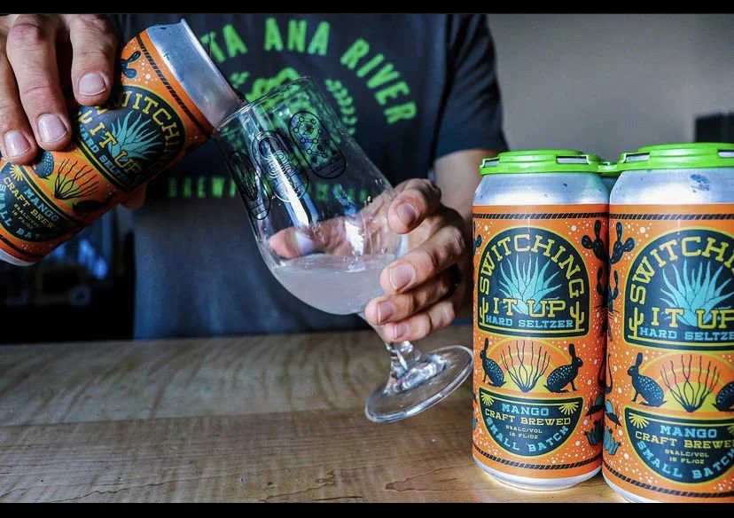
• Switching It Up – Mango Hard Seltzer A playful, desert-inspired label bursting with life—featuring jackrabbits, boots, snakes, and agave. The hand-drawn illustrations and electric orange backdrop create a festive, Southwestern vibe that makes this small-batch seltzer stand out on the shelf.
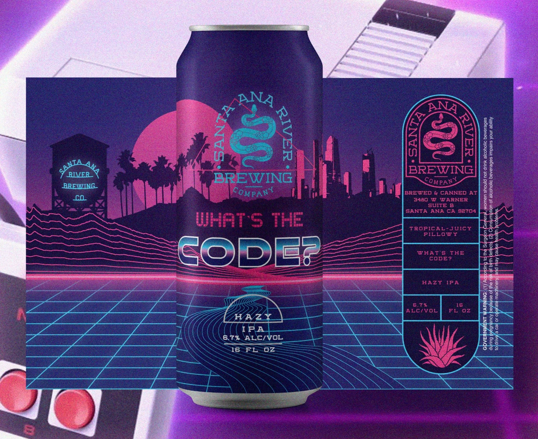
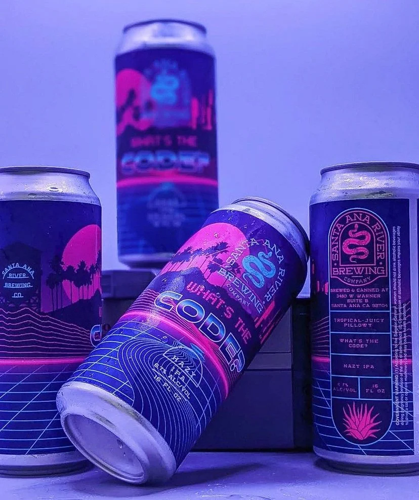
• What’s the Code? – Hazy IPA This retro-futuristic label channels 1980s synthwave aesthetics, complete with neon grids, palm trees, and a glowing skyline. Inspired by vintage gaming and SoCal nights, the design delivers a perfect visual metaphor for the beer’s juicy, dreamy haze.
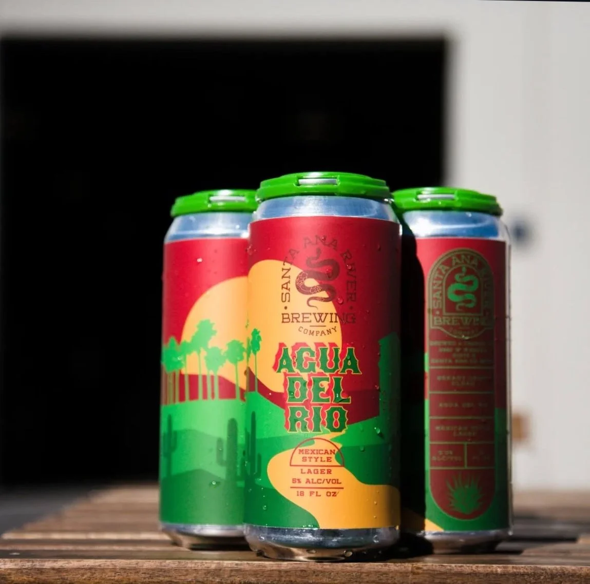
• Agua del Rio – Mexican-Style Lager A sun-drenched tribute to California’s riverbeds and borderland heritage. This can features rich gradients of red, gold, and green, stylized desert flora, and a rising sun behind silhouetted palms—echoing vintage travel posters and honoring the brewery’s namesake.
Each label in this series was thoughtfully illustrated and custom-typed to tell a story that’s both hyper-local and visually distinctive. The result is a bold and cohesive brand identity rooted in nostalgia, cultural symbolism, and the brewery’s independent spirit.